")
- Jim Dine: Cover Art Commentary by Gregg Hertzlieb
Gregg Hertzlieb on Jim Dine: Rancho Woodcut Art
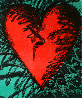
Jim Dine (b. 1935)
Rancho Woodcut Heart, 1982
Color woodcut on paper, 69/75
Byron Lee and Josephine Luecke Ferguson Donated Fund
Brauer Museum of Art, 2010.20.001We at the Brauer Museum of Art are grateful for a wonderful new addition to the museum’s permanent collection, purchased through the Byron Lee and Josephine Luecke Ferguson Donated Fund. Josephine Ferguson and her late husband Byron (who passed away in 2005) were for many years actively involved together with the Brauer Museum of Art in many capacities, and Josephine continues to support the museum through her donations, enthusiasm, and insights. She and Byron had a dream of establishing in the museum a Ferguson Gallery for modern and contemporary art; while Byron unfortunately was not able to see that dream realized, Josephine cut the ribbon for the beautiful new Ferguson Galleries in early 2011.
In addition to funding the new galleries, Josephine established an endowment for the museum and created a smaller scale fund for the purpose of purchasing modern and contemporary pieces to go into the galleries. Rancho Woodcut Heart by Jim Dine (b. 1935) was one of the first pieces to be acquired through this fund and to my mind stands as a flagship image for the new galleries; in addition to being a representative work by a major American artist, it also has as its subject an instantly recognizable symbol of love, and thus serves as a fine indicator of the fond feelings all of us at the museum have for Josephine, as well as of the feelings Josephine has for the museum and university.
While the galleries were in the process of being renovated, Josephine, founding museum director Richard Brauer, Valpo art history professor Dr. Nina Corazzo, and I had a meeting regarding new acquisition possibilities through the Ferguson Donated Fund. Our concentration was mostly on the filling of gaps existing in the museum’s collection. We were putting together a list of strong contenders but felt that we had not yet identified a particular work that excited all of us.
The next day, Josephine shared with me a brochure for a Jim Dine exhibition at a gallery from which she had purchased objects in the past. She liked the pieces reproduced in the brochure very much and asked my opinion. I must confess that concern was my first feeling; we already have in the museum two works on paper by Jim Dine from 1972 and 1983, and for our rather small collection I did not feel that another one was truly needed. However, Rancho Woodcut Heart, reproduced in the brochure, was one of the nicer heart pictures by Jim Dine that I had ever seen, and Josephine did really like it. Plus, something about the image seemed to feel right—I cannot explain such a feeling, but I think a museum collection achieves a kind of shape, focus, identity, or presence that perhaps reflects the sensibilities of the curator but also communicates to the curator its unity, its needs, its criteria for the addition of future components. I know such statements sound mystical, even silly, but please indulge me in my creative thinking here (and consider that an uncanny relationship can materialize over an extended period between a group of objects full of expressive power and that group’s daily caretaker). I called the gallery to get the price for Rancho Woodcut Heart. Finding the price quite reasonable, and trusting Josephine’s taste and the collection itself in its subtle urging to select this woodcut, I agreed with Josephine and shared my opinion with Richard and Nina that we should acquire it for the Brauer’s collection. They too agreed, and it now hangs proudly on a Ferguson Gallery wall, impressing all who see it.
Jim Dine is a key transitional figure between Abstract Expressionism of the 1950s and Pop Art of the 1960s. On gestural grounds, on expressively painted fields, he introduced widely recognizable images. These gestural, expressive fields by themselves constituted the primary focus for Abstract Expressionism, and Dine (as well as Robert Rauschenberg and Jasper Johns) including identifiable images, daily life images, in these fields marked a major shift in art—to the point where gesture largely disappeared in the heyday of Pop Art, and the commonplace images became even more recognizable, even more iconic, until paintings seemed to mimic or at least strongly resemble the products of mass consumer culture. While Abstract Expressionism captured the raw heat of creation, Pop Art was all cool irony, and Jim Dine and others of his generation enabled the shift from one to the other with works that are frequently humorous or playful, that show virtuoso technique, and that reflect highly personal perspectives.
In those transitional days, Dine began to identify themes and images that he continues to investigate and develop in even his most recent work. Key subjects for Dine include hearts, robes, tools, gates, trees, Pinocchio, plants, birds, and headless Venus de Milos. The hearts and robes are probably Dine’s most beloved, signature subjects, with the artist returning to them again and again and especially fine examples being widely reproduced on posters and note cards. The Brauer Museum’s 1983 piece mentioned earlier, titled The Robe Goes to Town, depicts a robe, while the 1972 piece is an untitled etching of a male face and a flower.
Throughout the book Jim Dine: Five Themes (New York: Abbeville Press, 1984), Dine discusses the five themes of the book’s title (hearts, robes, gates, tools, and trees), specifically what each theme means to him and why he selected it. His primary message is that although each theme, each subject has particular meanings for him, these themes or subjects offer opportunities for him to explore the act of painting, the act of printmaking, and allow him to match color and gesture to his attitudes about these subjects at various times in his life. All of these themes have a self-portrait aspect but most of all enable Dine to develop his insights and skills as an artist. As much as the individual pictures are about hearts, robes, etc., they are also about those things rendered precisely or broadly, in black and white or color, in thick or thin pigment.
For Dine, the heart is a full, ripe, voluptuous, suggestive shape that both summons up memories of Valentine’s Day and connects visually to the body and sexuality. The largeness of the subject in the picture frame captures viewers’ attention immediately, urging them to identify the reason for such an iconic image to be so prominently featured, and through distinctive graphic or painterly means. Something so familiar made unfamiliar through composition and scale (Dine’s paintings are frequently large, and Rancho Woodcut Heart itself is 47 ¾ x 40 ½ inches) makes for a thrilling viewing experience.
The medium for Rancho Woodcut Heart is woodcut on paper. Woodcut as a printmaking technique involves the artist cutting into a block of wood so that the design is left raised in relief. The design is then inked and printed, and in the case of color woodcuts several blocks are necessary. Since some physical exertion is required to carve a wood block, especially on a large scale, the medium lends itself well to abstracted, angular, hard-edged treatments that demonstrate the artist’s state of mind and working methods. Dine’s bold heart reveals the texture of the wood blocks or sheets used to make it, as well as the rough contours of the carved relief shapes. Interestingly, however, the print has many elegantly curved passages that belie the roughness often found in modern handlings of the medium; such sinuous areas were most likely achieved by the artist attacking the surface of the block or sheet with a power tool like a Dremel or grinder. A famously innovative printmaker, Dine pioneered the use of such tools on wood blocks as well as on (remarkably) copper plates for drypoint prints.
The word “rancho” in the title of the print perhaps refers to the location where the woodcut was created or the rich red and green colors that remind one of the outdoors, particularly in the American Southwest. In Five Themes, Dine comments on the juxtaposition of red and green in a discussion of his 1976 robe painting titled Cardinal: “I corrected, painted and built up that red against the green ground—you can’t miss with that combination” (p. 80). Due to a slightly off-kilter registration of blocks, some of the red of the heart on the right side goes beyond the black defining contours of the shape—one might say the color bleeds a bit, thus creating an interesting pun. Juxtapositions of green and red result often in a fascinating optical vibration arising from the two colors being complementary, opposite one another on the color wheel. Such a vibration enables the heart to stand out in high relief (another pun). Dine’s skillful manipulation of his spare pictorial elements makes such conceptual play irresistible and even adds to the picture’s overall appreciation.
I remember showing some Valpo students this print in the Ferguson Galleries, and one student wondered if the heart was broken. Atop the red color is Dine’s lively black gestural work, and one longer mark in the center seems to resemble a crack in the heart. I find the student’s observation to be interesting, but to me that line in its curviness more resembles a flourish, full of the energy that characterizes the dark shading overall. I encourage viewers out there to interpret the piece as they wish; no absolute rules exist in this game. For me personally, whenever I see this heart I will think of the generosity of a woman who has given with all her heart so that we in this community can be enriched by beautiful and significant works of art.
Gregg Hertzlieb is Curator and Director of the Brauer Museum of Art at Valparaiso University. Hertzlieb is the editor of the books The Calumet Region: An American Place (Photographs by Gary Cialdella), published in 2009, and Domestic Vision: Twenty-Five Years of the Art of Joel Sheesley (2008), as well as a contributor to The Indiana Dunes Revealed: The Art of Frank V. Dudley (2006). He has been awarded the Edward L. Ryerson Traveling Fellowship by the School of the Art Institute in Chicago and a Conant Writing Award for Poetry from Millikin University. His artwork has been exhibited widely, including at the Aron Packer Gallery, August House Studio, the Central School of Art and Design in London, Columbia College, Elgin Community College, the Goodman Theater, and Struve Gallery.