





Typography
Typography That
Reflects Valpo’s Identity
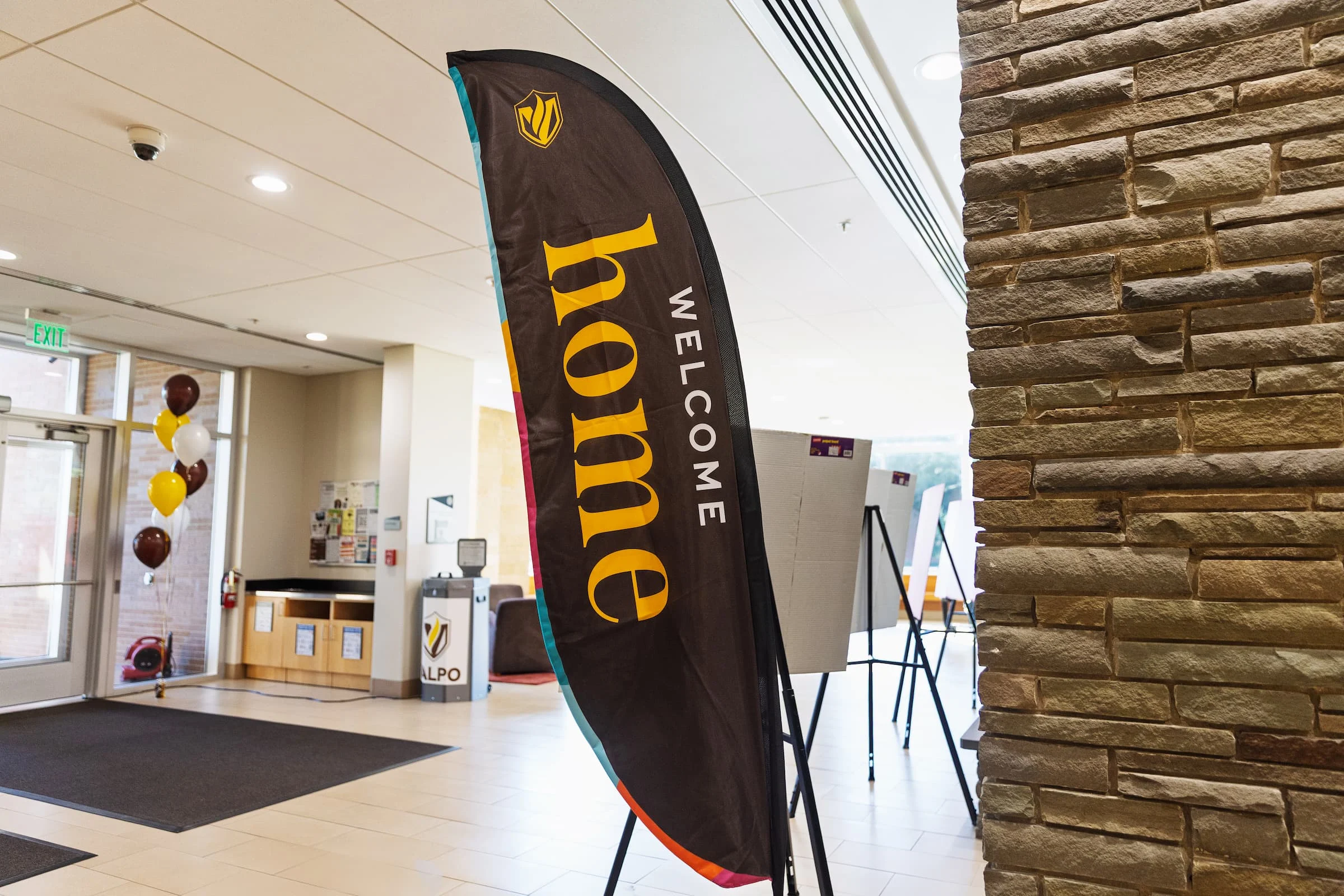
Our typography is designed to reflect Valpo as a whole: a harmonious blend of traditional and modern aesthetics. Our goal is to evoke a sense of heritage and fresh, forward-thinking energy through subtle design elements and classic letterforms. Consider typography an extension of the Valparaiso University personality. It conveys moods, tones, and meanings, and each typeface serves a specific purpose.
In section 2 of our brand guidelines, you can find additional information about our typography, like a typesetting example and when and how to use each typeface. For downloadable font files, please contact .
When brand fonts are not available, please use Verdana and Libre Baskerville on the Google ecosystem.
Find What You Need
Explore More
Questions? We have answers.
Use this AI-powered search to easily and quickly find any information that’s available on this website.